
Social House Cafe – Logo & Visual Identity Design
Project Overview
Social House Cafe is a brand built around the idea of community, comfort, and the shared experience of coffee. The goal of this project was to design a modern and recognizable visual identity that reflects both the natural origin of coffee and the social environment of a café.
The brand needed a logo that could communicate warmth, authenticity, and quality while remaining versatile enough to work across digital platforms, packaging, signage, and merchandise.
You can view the complete brand guidelines here:
Design Challenge
Coffee brands are extremely competitive and visually similar. Many cafés rely on generic coffee symbols, making it difficult to create a memorable identity.
The challenge was to design a logo that:
-
Represents coffee culture and social interaction
-
Feels modern but timeless
-
Works across multiple brand applications
-
Remains simple, recognizable, and scalable
Concept & Symbolism
The core of the logo is a stylized coffee cup integrated with a leaf-shaped element.
This symbol combines several meanings:
-
Coffee bean / leaf – representing the natural origin of coffee
-
Cup of coffee – the central product of the café
-
Community – inspired by people gathering and sharing coffee together
The organic shapes and rounded forms were intentionally designed to evoke comfort, warmth, and approachability, reflecting the welcoming atmosphere of a coffee shop.
Social Cafe Logo RN
Visual Identity System
Logo Variations
To ensure flexibility across different use cases, the identity includes multiple logo variations:
-
Primary logo
-
Horizontal version
-
Vertical version
-
Icon-only version
These variations allow the brand to maintain consistency across print, digital, and packaging applications.
Social Cafe Logo RN
Typography
The typography system was selected to balance character and readability.
-
Retro Race – used for the main logo to give the brand a distinctive and recognizable character.
-
Montserrat – used for supporting typography in marketing materials and print communication.
This combination ensures the brand feels modern, clean, and highly readable.
Social Cafe Logo RN
Color Palette
The color palette is inspired by natural coffee tones and organic elements.
Primary colors include:
-
Deep green
-
Coffee brown
-
White
These colors reinforce the idea of natural ingredients, warmth, and authenticity, which are key elements of the café experience.
Social Cafe Logo RN
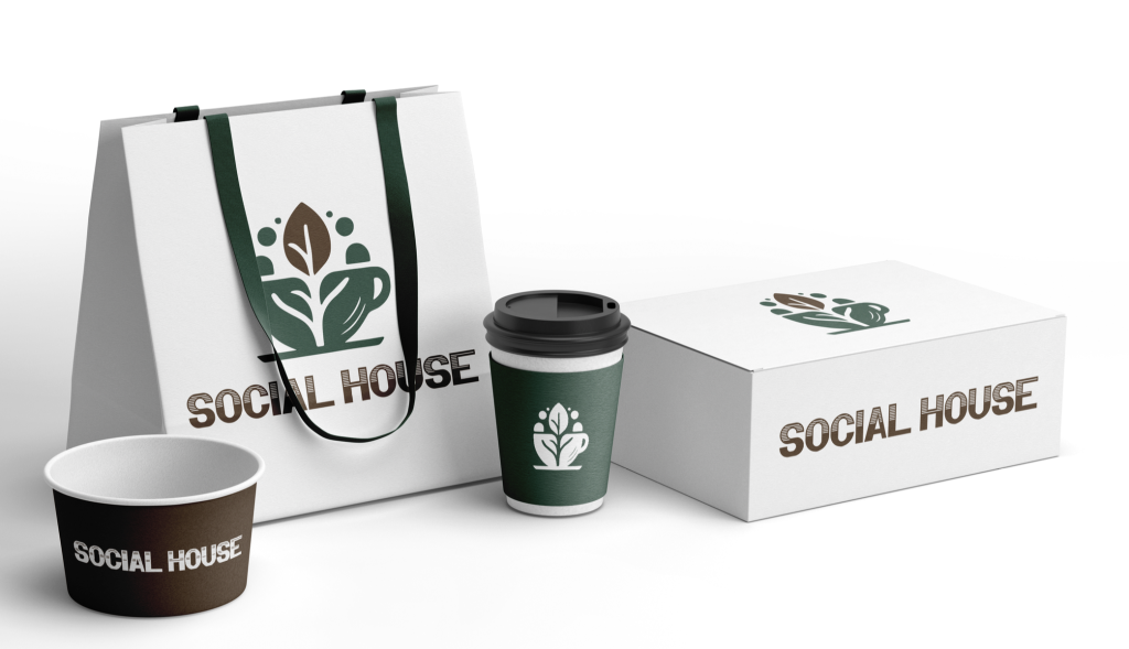
Brand Applications
To demonstrate the flexibility of the identity, the logo was applied to several brand touchpoints:
-
Coffee cups
-
Takeaway packaging
-
Shopping bags
-
Merchandise and promotional materials
These mockups show how the brand identity works consistently in real-world environments, strengthening brand recognition and visual cohesion.
Final Result
The final logo and visual identity successfully communicate the essence of Social House Cafe — a place where coffee, community, and conversation come together.
The identity is clean, memorable, and adaptable, allowing the brand to maintain a strong presence across both physical and digital experiences.
Features
- Adobe XD
- Adobe Photoshop
- WordPress
- Adobe Illustrator